 The front cover for any book should be interesting and try to convey in some way what is on the inside. For most people the cover of the book is what draws that initial interest and gets potential customers reaching for it.
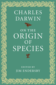
Some are quite understated, having very little on the cover except for the title and the author. Like the Origin of Species by Charles Darwin. It is a very understated design, but the book is so well known and respected, it doesn't require bells and whistles. This particular example is quite a nice shade of green, with a complimenting yellow trim. The font is a strong type, and the crisp white stands out perfectly against the solid colour.
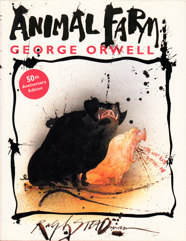 There have been many different editions of Animal Farm since it was first published in 1945 and all have had different covers, but one thing most have had in common, is the focus being on the pigs.
In the Ralph Steadman illustrated version, the cover shows the two main antagonists. Napoleon and Squealer. Both are distinguishable in the way they have been portrayed. Napoleon is the largest of the pair, and looks quite imposing, like a large black shadow. Squealer is smaller, but his mouth is quite wide and the dialogue coming out of it, is one of the many slogans that Squealer himself encourages the other animals to chant.
Steadman's style is very recognizable, there is a certain amount of control in the execution of the characters, but the ink splashes and the apparent randomness of lines gives the impression of an unsteady hand but this is quite the opposite. Each splodge and scribble is exactly how the artist has wished it. It might have taken some trial and error before he got those marks the way he wanted, but each one is the desired outcome of the brush.

As with other versions of the book, the cover also features the recognizable caricature of a pig, shaded entirely in red, the shade of which harkens back to the colour of the soviet flag.
For my own version of the cover I am eager to use one of the images I created early in the days of my experimentation. The image was inspired by an actual revolutionary poster and was screen printed very successfully. It turned out so well that it had to be used but there was no place for it as one of the finished illustrations.

The thumbnail at the base of the spine is a snip of the pig in the image and shrunk down to fit.
This design is one of my favourites. I was very eager to create a cover that had little to no text on the front. I felt the image, along with the well known phase 'All animals are equal' was a strong enough indicator of what the book is.
These elements have worked well, but the one thing I would change is the font. It does not have the right 'feel' for the story. It calls for something bolder and more angular, rather than the italicized, hand-written style. It is to slender and not strong enough for the theme of the book. The font on the front cover is also not working. It is too big and clashes somewhat with the image because of this.
While I like this design, it is best suited to something other than a book. Possibly a DVD.
 These next two are more or less identical just with slightly different variations of colour.
  Here I have used two images, one being the design that was screen printed in earlier days of the module. This features on the front of the book, the three animals representing the three aspects of the farm and its occupants. The back features another well known image from the book. The windmill is from one of the illustrations I have created, and is framed by the black and white boarders of the cover.
The layout for this design is much better and we have space for the books 'blurb' on the back. The font is much more suited to the theme of the book, bold and angular and feels more like Russian print.
While both are more or less the same, I am drawn to the white variation. Both the front and back designs stand out better on the white backdrop and the spin is less confusing to read with just the one solid colour running through it.
 |
| The final design for the cover of Animal Farm. |
No comments:
Post a Comment