Tuesday 12 May 2015

Narrative - Evaluation

Thumbnail
 I would be lying if I said the work in this module turned out exactly as I envisioned it to be in the early days of this task. Each of the illustrations started out very differently in my head and some I had planned on creating didn't make it past the thumbnail stage, but overall I am pleased with the finished designs.


Materials

Character development page
coloured with coffee
In the early days of experimentation the materials used were mostly traditional mediums of graphite, fine liner and various kinds of paint. I used these mediums as I developed the characters, taking the opportunity to explore their use and effectiveness in communicating the various aspects of the creatures of the farm. I felt very confident using the gouache and watercolour paints to add washes of colour to the animals in the development work and these worked very well in adding dimension and depth. However as I further explored the history that inspired the book, I was introduced to the propaganda of the Russian 1919 revolution and felt deeply that I should take some inspiration from these works and incorporate some of their ideas and processes into my work.

These works are very bold and hard hitting, and I just could not reproduce this effect using graphite or fine liner, but with gouache I felt I would have more success and so I set to work reproducing some of the propaganda posters, using the bright, vibrant highly pigmented paint.

The paint worked relatively well and I was able to get both the bright, bold, block colour but also the subtle, muted hues required when I recreated this poster from 1919 that called the Russian people to arms. I was attracted by the strong geometric shapes that made up the middle star, hammer and sickle.

I was not completely happy with this finished product because my lack of experience using gouache meant that I did not get the consistent flat, even coloured effect I was attempting to reproduce.


Propaganda poster with limited
colours.
A lot of these art works were limited to a handful of specific colours, dedicating each shade to a tonal value of the design. As in the poster (left) it has been created using two colours of black and red, with the white of the page making up the third. The black has been used for the shadow/shaded areas of the design, with the red as the mid-tones, leaving the white of the page for the highlights and features like the mans beard and the scholars scroll.


In another attempt with the gouache, I recreated the poster above, but with some changes suited to Animal Farm, replacing each man with a character from the book that also fit the role portrayed.

Again I had some success, the colour was bright and had the visual impact, however there were some places where the paint did not cover as flawlessly as I wanted, leaving streaks and an uneven finish. I feel that this was due to my lack of experience using this medium. Because of this I decided not to use gouache in my final illustrations as I felt the work would suffer from my lack of skill with the paint.

Screen printing this same design provided a wealth of experience with a new technique, one that suited the style I was attempting to recreate. It was definitely suited to the poster I printed, but for the final illustrations, I foresaw many stumbling blocks. Time wise, it wasn't possible to create every image this way as it would require unfettered access to the print room, which would prove problematic as sometimes this just wouldn't be possible.

The book dimensions I am working with (11cm x 18cm) are quite small, and while it would be possible to create images via screen printing larger before scaling them to size digitally, I felt the whole screen printing process and effect would be lost in doing so, making it a somewhat redundant step. But what I could do, was to create the images digitally (something which I would have done anyway had I gone the screen printing route), ready to be printed directly onto a book page. These digital files could then be used to create screen prints also, recreating the illustrations into full size posters. I felt this was the most time and cost effective way to do this, as it allowed me to create the designs for the book, but also allow me the flexibility to create more art works as companion pieces for the work.

In the end when it came to producing my final illustrations, I initially opted to do it all using computer software, however I wasn't completely satisfied with the result and so reverted back to a more traditional medium when designing the line work in particular. Where the digital influences really helped, was in applying the colour and providing a means for more experimentation. I was able to use a variety of tools and brushes in photoshop, which allowed easy editing of line work and clean up, as well as colour adjustment and changes, until I was completely happy with the look.


Looking back I feel I made the right decision in choosing the materials and mediums I did, however if I had to do it again, I would have pushed harder to get a more preferred result with the gouache. I also would have experimented with Copic Markers earlier on, as it was only very recently I discovered their capabilities and ease of use. They actually provide a smooth, flat colour finish that I was after.

I struggled a lot with colour, especially when I dropped the restricted palette. Having so many options and opting for a more realistic scheme of colour ended up causing so many problems and the work became unlike any of the Russian propaganda art that I had researched. Going back to that restricted choice put the work back on track and looking more like what I had imagined. If I was to do this again, I would again limit my colour options, but would experiment more with vivid hues but initially red was the logical choice as that is synonymous with Russia. 


Narrative - Fashioning the Front Cover

The front cover for any book should be interesting and try to convey in some way what is on the inside. For most people the cover of the book is what draws that initial interest and gets potential customers reaching for it.

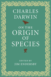
Some are quite understated, having very little on the cover except for the title and the author. Like the Origin of Species by Charles Darwin. It is a very understated design, but the book is so well known and respected, it doesn't require bells and whistles. This particular example is quite a nice shade of green, with a complimenting yellow trim. The font is a strong type, and the crisp white stands out perfectly against the solid colour.


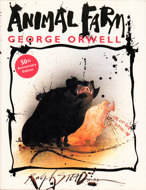
There have been many different editions of Animal Farm since it was first published in 1945 and all have had different covers, but one thing most have had in common, is the focus being on the pigs.

In the Ralph Steadman illustrated version, the cover shows the two main antagonists. Napoleon and Squealer. Both are distinguishable in the way they have been portrayed. Napoleon is the largest of the pair, and looks quite imposing, like a large black shadow. Squealer is smaller, but his mouth is quite wide and the dialogue coming out of it, is one of the many slogans that Squealer himself encourages the other animals to chant.

Steadman's style is very recognizable, there is a certain amount of control in the execution of the characters, but the ink splashes and the apparent randomness of lines gives the impression of an unsteady hand but this is quite the opposite. Each splodge and scribble is exactly how the artist has wished it. It might have taken some trial and error before he got those marks the way he wanted, but each one is the desired outcome of the brush.

There are many more covers to draw inspiration from with regards to designing the front cover. A lot are like this one, with bold red and black blocks of colour. The type is bold and clear against a banner of black. The font is not white, but a subtle warm hue so it is not to stark when set against the backdrop of the image, this is something I have done when designing the illustrations themselves.

As with other versions of the book, the cover also features the recognizable caricature of a pig, shaded entirely in red, the shade of which harkens back to the colour of the soviet flag.

For my own version of the cover I am eager to use one of the images I created early in the days of my experimentation. The image was inspired by an actual revolutionary poster and was screen printed very successfully. It turned out so well that it had to be used but there was no place for it as one of the finished illustrations.

For the first attempt at designing the cover I chose to lay the entire image over both the front and back of the book. The spine of the book runs right through this image but I have made enough adjustments so the original image was not obscured too much.

The thumbnail at the base of the spine is a snip of the pig in the image and shrunk down to fit.

This design is one of my favourites. I was very eager to create a cover that had little to no text on the front. I felt the image, along with the well known phase 'All animals are equal' was a strong enough indicator of what the book is.

These elements have worked well, but the one thing I would change is the font. It does not have the right 'feel' for the story. It calls for something bolder and more angular, rather than the italicized, hand-written style. It is to slender and not strong enough for the theme of the book. The font on the front cover is also not working. It is too big and clashes somewhat with the image because of this.

While I like this design, it is best suited to something other than a book. Possibly a DVD.

These next two are more or less identical just with slightly different variations of colour.

Here I have used two images, one being the design that was screen printed in earlier days of the module. This features on the front of the book, the three animals representing the three aspects of the farm and its occupants. The back features another well known image from the book. The windmill is from one of the illustrations I have created, and is framed by the black and white boarders of the cover.

The layout for this design is much better and we have space for the books 'blurb' on the back. The font is much more suited to the theme of the book, bold and angular and feels more like Russian print.

While both are more or less the same, I am drawn to the white variation. Both the front and back designs stand out better on the white backdrop and the spin is less confusing to read with just the one solid colour running through it.

The final design for the cover of Animal Farm.


Monday 11 May 2015

Narrative - My Process - Illustrations 9 - 10


This illustration represents the moment in the story where Napoleon finds the nine puppies and takes them away under the pre-tense that he will educate them, when actually he intends to train them to be his personal guard dogs as the next time we see the puppies, they are full grown, vicious and loyal only to Napoleon. 

The puppies in this scene are the very embodiment of their nature. Small, clumsy, cute and trusting of the pig who has taken under his care. They wag their tails in his presence, (something that continues into their adult lives, but this gesture is reserved for the Bershire himself), and obediently follow his lead. The scene is designed to communicate both of these facts.

I chose to keep Napoleon's face obscured by the angle, as what is important here is the absolute trust and peaceful nature of the dogs at this point. It makes their next scenes (the Massacre and Bad Dog) more of a shock to the observer and they are left wondering what has happened to the innocent puppies.


The closing scenes of the book are perhaps what stays with the reader. It is shocking and controversial and possibly the reason Orwell had such a hard time getting the book published. 

The story up until this point has demonised Starlin/Napoleon, and depicted the plight of the Russian people/Animals under his rule. What the closing chapters of the book do next, is to point out that Napoleon is now completely corrupted by his greed and thirst for power, but it also compares him to the Human neighbours of Animal Farm, humans who represent the US and UK leader at the time of WW2. This is what Orwell has been leading up to, revealing to the reader that each member of the alliance in WW2 have ulterior motives, that everything they do is self serving and that the people the world over, even those who believe they exist in a fair and safe country and that their rights are protected, are in the greatest danger. Those who govern, do so for of their own selfish agenda and privilege. They are always well fed, have the best homes and the finest clothes. 

The image is a double page spread, with space in the top left for some text. For this scene I have focused on both the pigs and human faces, keeping them as similar as possible without loosing (the pigs especially) distinguishing features, because as the animals look from man to pig and pig to man, they are unable to tell the difference anymore. Their faces are cast in deeper and darker shadows the closer we get to Napoleon on the far upper right of the page, symbolic of the characters black heart and dark intent. Squealer is directly below him, with his large round face and goofy front teeth, his flesh spilling into folds of skin and fat, from gorging on food and a life spent doing very little while others around him are worked to death. Everyone is wearing suits and ties of some sort, the uniform of the politician and those in power, each one tailor made and pristine. They are unable to empathise with the plight of the animals, in fact they relish in the misery they have witnessed during their tour of the farm. They are happy that the people are under control. Happy that the people are put to work, starving, have very little and are no longer a threat to their own seat of power. Any indication of another rebellion on this farm, or those that surround it, is nil and that is how they like it.

The image shows the grotesque nature of the pigs and men, matched only by the ugly features they wear. They are laughing and smiling, having won and this is the end of the story. There is no happy ending for the animals and there is no squeal. That is the end and it is intended to anger the reader as they too draw comparisons between the characters in the book to politicians of the world as Orwell intended.


Friday 8 May 2015

Narrative - My Process - Illustrations 7 & 8

The Battle of Cowshed
Previous version of the Battle of Cowshed

When I originally designed this scene the perspective was completely different and the image was very colourful, both elements not working well and what I was attempting to communicate was lost amidst that chaos. The scene needed to be completely overhauled and so it was back to the drawing board (literally).

I have attempted to create a more dynamic scene and started with a more unusual perspective. Instead of looking side on at the scene, I have attempted to put the reader right into the action itself. The reader is now facing the mob of angry farm animals directly, with the creatures either rushing passed or towards the reader.

The new sketch feels less flat, with more motion and a more natural stance for Boxer (horse).


The faces of the animals are much more expressive, especially Boxer, who's eyes show a crazed anger, emphasised by a small pupil in a wide white eye. His lips are draw back, baring teeth in a mouth that is large and unhappy. The hair in his mane is much more natural and flows along his neck, a vast improvement to the previous version where his mane was more like clumps of pointy shapes.

The perspective also allows the scene to gradually diminish the further back the reader looks. The two cows are on different planes, the one closer wearing more detail compared to the second, who is almost completely cast in shadow. It gives the impression that the animals are gradually charging towards the reader and out.


This was the first time I experimented with a restrictive colour palette, limiting my choices to the red, black and the empty space of the page. At first I kept the page white and experimented with the application of various shades of red with different brush tools. The splashes and droplet effects offered an exciting and varied stroke to the paint but I soon found the image itself got lost and the two shades of red seemed to clash.


I left this scene until I had a more concrete idea of the colours I was going to use and ended up completing six other illustrations before finally returning back to this image.

I have added the colour, but kept it much more simple, using a brush effect to give the impression of motion. The image is a full two page spread, with an accompanying text. The back of the horse and the rear of the rest of the animals all point towards the centre fold, so that when the page is opened, it is inferred that they are charging from the gutter of the book.

After some initial problems bringing this image to life, I am pleased with the result. It communicates the anger of the animals, in their expressions and stance. It has motion, thanks to the application of the colour and the brush effects. And it also has drama, influenced by the perspective.


Molly

Molly is the pretty white horse who leaves the farm soon after the rebellion because she misses the luxury provided by the exiled human masters.

For this image I wanted to show her beauty (and ultimately her vanity). She has very soulful, dark eyes as she looks towards the offered human hand of friendship. She is slightly back from the offered hand because interaction with humans after the rebellion is strictly forbidden, but the way she looks almost longingly at the offered hand, communicates her hidden desire to have a master once again.

This is to be a half page illustration, for the scene where Molly is seen allowing a human to pet her nose.


Tuesday 5 May 2015

Narrative - My Process - Illustrations 5 & 6

The Massacre

This image represents one of the darkest few pages of the book. It is the part where numerous animals are slaughtered by the nine dogs at Napoleon's bidding, sentenced to death for collaborating with the exiled Snowball or conspiring against the Berkshire Boar himself.

For this scene I wanted to create both a harrowing and chaotic image. I chose to illustrate the torn and mangled bodies of the animals who were killed, pilled up and discarded, while in the foreground, a sheep stands bleating its last as its life blood pours from a fatal wound to the neck. This will be a full two page spread with no text at all. The reader will be met with nothing but this scene. I have kept the line quality fairly broad and jagged in places, to emphasise the shabbiness of the creatures fur and feathers.


With the colour added, I have kept it restricted to the areas where blood had either pooled under the dead bodies, or is draining from them. I have also added shading and a pale red to the animals who are either pink or red in colour.

Out of all the images I have created so far, this is the one I am most disappointed with. I don't feel it has the impact I was hoping for and certainly needs something else to communicate the harrowing nature of the scene. I may return to this image with fresh eyes and make some adjustments.

Bad Dog

This scene is meant as a companion piece to the Massacre scene above. When the reader turns the page on the Massacre, they are then met with a two page vignette of one of the dogs, having killed a chicken and appears to drag it across the pages. A number of feathers float still on the air, suggesting that the bird has been killed in that moment.

The line work is more fluid when compared to the previous page, and a central bold line joins both the chicken carcass and the delinquent dog. This helps to link the two together (despite being positioned on opposing pages) and helps the reader to determine what has happened in the moment before the page was turned. This is meant to shock the reader slightly, but also alleviate some of the previous tension. While the scene is macabre, it is delivered in a more humorous way. The position of the dead chicken is quite amusing and the dogs body language is almost friendly, as it looks off page to its mater for approval of a job well done.


The addition of the colour helps to tie in the events of the previous page to this one. The blood coming from the chicken's body flows to the left, back towards the previous scene leaving the reader wondering if this is all the chicken's blood, or whether the violence from the image before is actually bleeding into this one. Bloody paw prints lead the way across the page to one of the perpetrators of the violence and fading red elliptic shape, symbolises a setting sun and an end to a horrific day for the animals.

This is one of my favourite illustrations from this module. Out of them all, I am the most happy with this one, it symbolises everything I am trying to communicate here. If I was to change anything, it would be the addition of the blood around the dogs mouth, I feel that this was not needed. The reader has enough visual prompts to know who is responsible for the animal's deaths and this one is surplus to requirement.


Monday 4 May 2015

Narrative - My Process - Illustrations 3 & 4

The Last Rock

 For the next illustration, I am working on the scene in the book where Boxer, the hard working horse of the farm, is finally over-come with exhaustion and fatigue.

Up to this point, Boxer had been working harder than anyone else on the farm. He gets up early and is the last one to leave the building site. Over the course of the book, it is also indicated that food rations are reduced and work loads increased. This is likely to have a physical effect on Boxer especially who is working harder than any other.

In these sketches I have experimented with the expression of the character. I have attempted to make him appear, fatigued and thin. To aid in achieving this look, I have kept the line work thin, with harsh angles where the bones come near the skin. In each picture, Boxer is on his knees unable to hold himself up, further indication of his state of health.

 While I was happy with some of the sketches, I was not happy with the position of Boxer. I wanted to show a much more dramatic pose. I kept the angular, thin lines and adjusted the position of Boxer so instead of being on the ground, he is in fact, falling.

I feel this is a much more exciting scene, as it now has the added drama and anguish of the horse as he finally buckles under his own diminished weight, no longer having the strength to support himself. His expression is one of fright and confusion, his mouth parted as if he is calling out and his eyes wide and filled with sorrow.

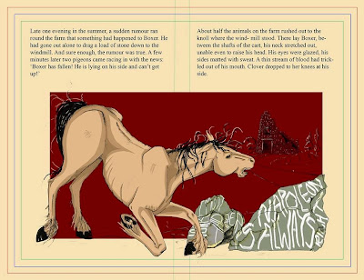
This is the image of Boxer I will be using for the illustration, titled The Last Rock. In it, Boxer will be falling by the rocks he was attempting to transport to the build site for the windmill. Each rock will have one of the two slogans that Boxer adopted as his moto's. "I must work harder.' and 'Napoleon is always right.'

After scanning in the chosen line work, I added colour in the same way I had done with the previous illustrations. The rocks were added in the foreground with Boxer, so he is actually falling down beside them. The text on the rocks is haphazard and it is difficult to read the words, but any familiar with the character and the book (as they will be upon reading this far in the story) will soon see the familiar slogans that Boxer himself has been saying since the rebellion. In the background we can see the unfinished Windmill that the animals have been working hard to build. It looms there, a sad testament to the hard work, that unfortunately for Boxer, will amount to nothing, as shortly after this scene he is sent to his death.

I have set this mock page up to see how this particular illustration would look and how it would sit upon the page.

It was always meant to be a double page spread, but small enough to allow some of the book text to read out the description of the scene. While my illustration does not exactly match the written description, it was never meant too. My purpose was to incorporate symbolism and drama, hoping to make the reader sympathetic to the horses plight and I feel I have managed to do this.

The elements work well together, but the Windmill does not stand out very well, it gets lost in the flat, block colour of the red. Further highlights need to be added to make the structure pop out more, or lighten the red colour so the existing line work is more visible. 

The Windmill

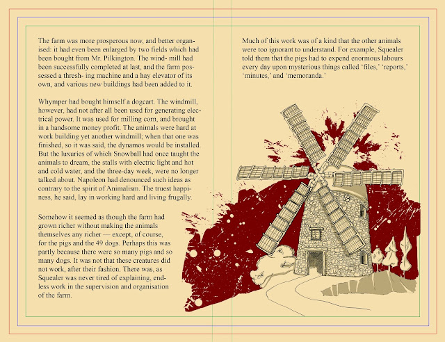
The Windmill also features in its own illustration, near to the end of the book and serves as a half page vignette, to emphasise the completion of the structure. The windmill in this image is complete and has the working components it has missed up until the end of the book. 

I wanted to do a fairly detailed and delicate sketch and so hand drew each and every stone, to symbolise the hard and dedicated work of the animals who had constructed it. I added the surrounding flora and landscape to give an idea of its size and also to show that it is part of the landscape. A well worn path leads to the structure as, apart from the work done during the construction, the windmill is now a central feature in the running of Manor Farm (previous Animal Farm, previously Manor Farm).


 In this final version of the windmill scene, I have added colour (restricted to the limited colour palette I have chosen for this project) and shading to add definition and create a more three-dimensional quality. When set against the flat colour of the red flurry, it stands out more boldly.

For the red, I decided to experiment with the brush effects in photoshop and created a semi-chaotic skyline that silhouettes the Windmill. The calm, tranquil landscape when set against the haphazardly painted sky creates an interesting contrast. I chose to do it this way because both moods, while completely opposite resulting in the contrast, also depict, symbolically what I am attempting to communicate here.

The line quality is serene, peaceful, communicating a well constructed, practical building on a working farm. The final testament to the fact that the animals themselves are perfectly capable of not only managing the farm, but are also capable of great things. It stands proudly on the hill.

The painted sky, by contrast is angry and violent. The splashes represent the chaos and hardship that the animals suffered while working on this structure and it hangs around the building like an aura of death and suffering. It also bleeds onto the previous page, indicating that in the pages that came before this one, is where this negativity came from.